Web Design
Birbank.az Redesign
Redesigning Birbank.az into a scalable digital banking platform through a unified visual language and design system.
Year :
2024
Industry :
Fintech / Digital Banking
Client :
Birbank
Project Duration :
Phased rollout
Redesigning Birbank.az, One Product at a Time :
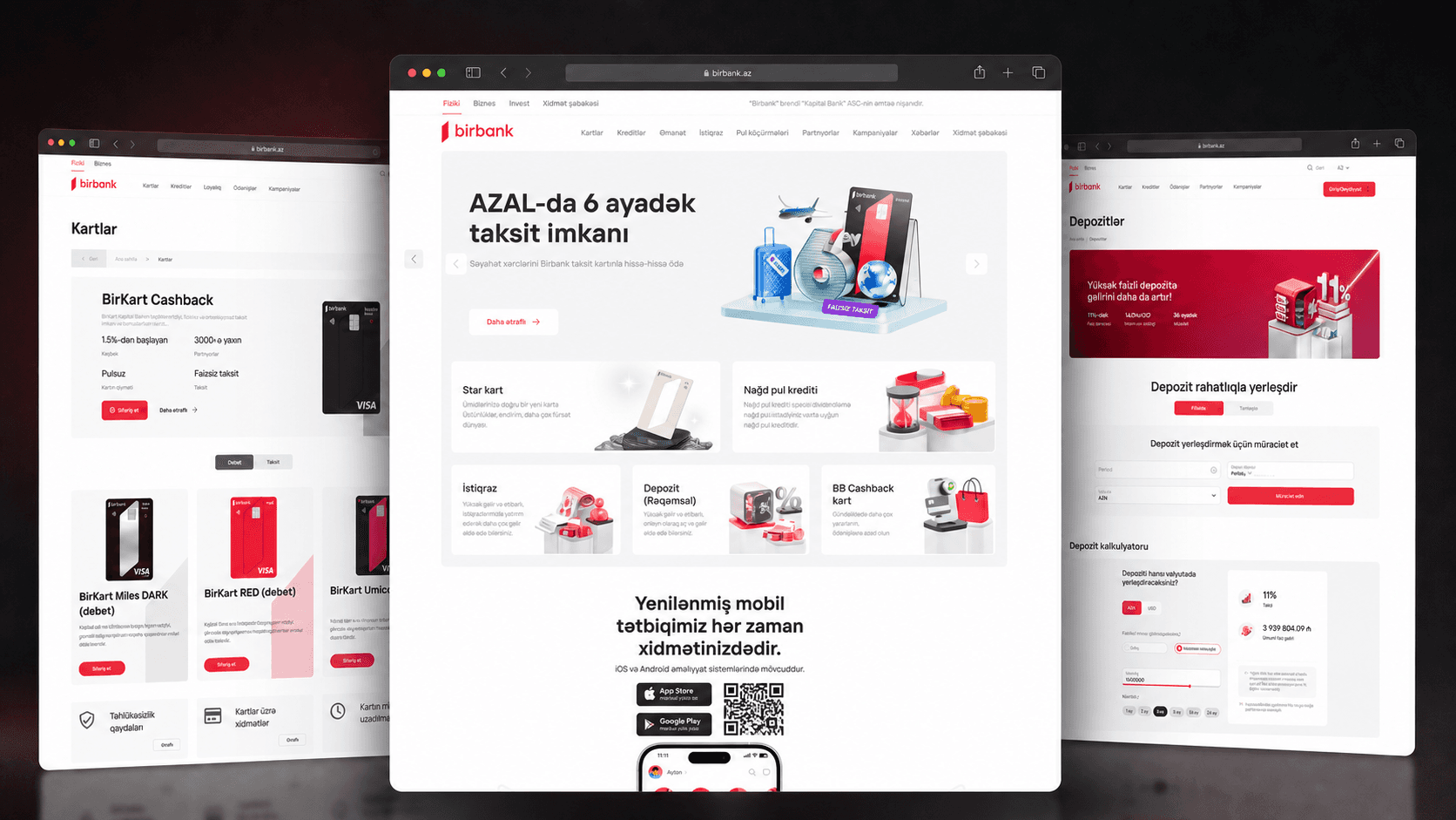
The redesign of Birbank.az began in the first quarter of 2024 as a full transformation of the website. Every major area needed to be reconsidered to support Birbank’s evolving products, introduce a more consistent visual language and establish a scalable design system.
Birbank.az serves customers across Azerbaijan who want to explore and complete everyday banking tasks more quickly and easily. The goal was not simply to modernize the interface, but to create clearer paths between understanding a product and taking action—whether applying for a loan, choosing a card, opening a deposit or accessing another banking service.
I worked as the sole UX/UI Designer and was directly involved in the entire end-to-end process. I received requests from the stakeholder, organized discussions with product owners, clarified requirements and translated them into user flows, interface solutions, responsive designs and reusable components. I also prepared prototypes, maintained the design system and managed the handoff to developers.
The delivery team included two frontend and two backend developers. Because the existing backend and core site structure largely remained in place, most of the implementation work was handled by the frontend team. Design decisions were reviewed weekly and agreed collaboratively with stakeholders, product owners and developers.
The redesign followed a page-by-page rollout. Once a page was reviewed and approved, I worked directly with the developers during implementation. Each release was then tested internally before being deployed to production, allowing the website to evolve gradually alongside new and updated banking products.

From Hidden Products to Clear User Paths :
The first challenge was discoverability. Birbank offered a broad range of products, but many of them were visible mainly through the navigation menu. The homepage did not give enough priority to the products customers needed most, making it harder to understand the bank’s offering or choose a relevant next step at a glance.
The mobile app was another missed opportunity. Many everyday banking operations could already be completed in the app, but its presence on the website was not strong enough to guide users there. Calculators also existed, yet their structure and feedback were not always easy to understand. Supporting services lacked a clear entry point, while several product pages relied on long, dense blocks of text with limited hierarchy. Large collections such as partners and campaigns became difficult to scan as their content grew.
I started with a page-by-page audit of the existing website and combined the findings with heatmaps and Google Analytics to understand attention patterns and user movement across key pages. I also reviewed local and international banking experiences, using international benchmarks where they offered clearer solutions. Weekly discussions with stakeholders and product owners helped connect these observations with product priorities and business requirements.
The audit revealed a second, system-level problem. Without a shared design system, heading and paragraph styles, colours, buttons and recurring interface elements could vary between pages or be interpreted differently during development. This affected both visual consistency and implementation quality, making every new product page harder to scale.
Progress also depended on incomplete product content and limited structural flexibility. The backend and much of the existing site architecture had to remain in place, while detailed content was not always available at the start of a task. I clarified requirements with product owners, reorganised existing information and took initiative in proposing improved copy and visuals. When product rules had not changed, I reused validated content from the previous experience, then presented the revised solution to product owners and stakeholders for approval.
These findings made the homepage the natural starting point. The redesign needed to surface priority and high-demand products immediately, give the mobile app a stronger role, make calculators easier to understand, introduce clearer access to services and establish a consistent hierarchy that could scale across the rest of the website.

Building a System That Could Scale :
Once the main experience problems were clear, the next step was to create a structure that could support both the redesigned website and future product releases. Product visibility was reorganised around user and business priorities: high-demand products were surfaced earlier, the mobile app received a more prominent role, calculators were redesigned as clearer decision tools and supporting services gained dedicated entry points.
Consistency was essential for scaling this approach across the website. I had created the initial Birbank.az design system, establishing a shared foundation for typography, colours, grids and reusable interface patterns. As the redesign expanded, limited internal capacity made it difficult to dedicate enough time to a full system refresh, so we partnered with an external vendor to help evolve the library.
The vendor collaboration did not replace internal design ownership. I remained directly involved in system workshops, component decisions and review sessions throughout the process. Together, we developed the system step by step in a separate Figma library, covering recurring patterns such as buttons, inputs, selects, tabs, cards, accordions, tables, headers and their responsive variants and states.
My responsibility was to make the system work inside the actual product—not only as a component file. I connected the shared library to the redesign files, applied its patterns across new pages and managed the handoff to frontend developers. During implementation, I explained component behaviour, responsive rules and states, helping the team use the same structure consistently rather than interpreting each screen independently.
The refreshed visual language also introduced 3D illustrations. I collaborated with specialist 3D illustrators by defining the scenario, product message, required objects and intended composition for each asset. The illustrators developed the visuals from these briefs, while I reviewed the results and guided revisions until they fitted the interface and communicated the intended product story.
The impact became visible during design QA. With shared components, clearer rules and reusable states in place, implementation became more predictable and significantly fewer visual inconsistencies were observed across new releases. The design system became the foundation that allowed Birbank.az to evolve page by page without losing coherence.

Designing the Core Experience :
Turning complex banking products into clearer, more actionable journeys
Once the homepage direction was established, the redesign continued through a phased, product-by-product rollout. Instead of attempting to update the entire platform at once, I worked through each category by identifying the available products, clarifying their priority and then redesigning the relevant landing and detail pages.
The credit section was one example of this approach. Together with product owners and stakeholders, I reviewed the available credit products, determined which ones needed greater visibility and reorganised the experience around clearer user priorities. This process was then applied across other product categories, allowing each approved page to become the foundation for the next stage of the redesign.
Establishing the Homepage as the Product Gateway
The homepage was the most challenging part of the project because it needed to introduce the full range of Birbank services without overwhelming users.
Previously, key products were mainly discoverable through the navigation menu. In the redesigned experience, high-priority and frequently used products were surfaced directly within the upper part of the page. This allowed users to understand Birbank’s core offerings immediately and reach relevant product journeys with fewer steps.
The new homepage also introduced:
A prominent mobile application section designed to direct users towards services available in the Birbank app.
Dedicated product blocks for cards, loans, deposits and other priority offerings.
A services section that brought supporting banking functions into the main experience.
A clearer content hierarchy that separated products, tools, campaigns, news and supporting services.
More focused calls to action based on the purpose of each section.
Making Calculators Easier to Understand
The calculator experience was reorganised around three product categories. Labels and supporting microcopy were revised, while additional filtering options were introduced to help users narrow down their selections and understand the available conditions more easily.
Inputs, filters and calculated results were arranged in a clearer sequence, reducing the amount of interpretation required from the user. The goal was not only to present numerical results, but also to help users understand what they could adjust and what action they could take next.
Designing Responsively Within Delivery Constraints
A fully adaptive mobile experience would have allowed each screen to be restructured independently for smaller devices. However, it would also have significantly increased development time.
To balance experience quality with delivery constraints, I followed a responsive design approach that remained close to the approved desktop structure. Within this framework, I optimised content order, spacing, typography, card behaviour and interaction areas for smaller screens.
This made it possible to preserve consistency across devices without creating a separate and significantly heavier implementation scope for the development team.
From Approved Design to Production
Each redesigned page followed a continuous delivery cycle:
Product review → UX/UI design → Stakeholder approval → Developer handoff → Internal testing → Production release
I reviewed requirements with product owners and stakeholders, refined the design based on shared decisions and worked directly with developers during implementation. Once developed, pages were tested internally to identify visual or functional inconsistencies before being released to production.
This phased approach allowed the website to evolve gradually while keeping product decisions, design quality and technical implementation aligned throughout the project.

Delivery, Impact & Learnings :
The redesign was delivered through a phased release process rather than a single large launch. Once a page had been reviewed and approved, I prepared the developer handoff, clarified component behaviour and responsive rules with the frontend team, and remained involved while the design was implemented. This continuous collaboration made it possible to resolve questions early and keep the final product aligned with the approved experience.
The design system significantly improved the workflow for both design and development. Shared components and documented states reduced repeated decisions, made handoffs easier to understand and helped developers build new pages with greater consistency. Instead of interpreting recurring interface elements separately for every release, the team could work from the same reusable foundation.
After each release reached production, the experience went through QA testing. Visual and functional issues were documented, discussed with the development team and resolved through subsequent fixes. This feedback loop helped close the gap between the design files and the live product, while the systemised component approach led to noticeably fewer visual inconsistencies over time.
Although a complete set of quantitative KPIs was not available for the case study, an increase in product orders was observed after the redesigned experiences were released. The work also received positive feedback from stakeholders, product owners and developers. These outcomes indicated that the redesign was improving both the customer-facing journey and the internal process used to deliver it.
One of my most important learnings was the value of understanding the product beyond the initial design request. Regular discussions with product owners helped me learn the conditions, priorities and limitations of each banking product before translating them into an interface. Working closely with developers also gave me a clearer understanding of where implementation became difficult and how design decisions, component rules and handoff documentation could reduce that friction.
If I were starting the project again, I would give the Birbank mobile application an even stronger role throughout the website. Rather than presenting the app mainly as a dedicated promotional section, I would connect more product journeys directly to relevant app actions. I would also reduce the amount of explanatory copy further, using clearer hierarchy and progressive disclosure to help users reach essential information and actions more quickly.
All pages included in the redesign scope have now been completed. The final result is not only a renewed set of screens, but a more scalable product foundation supported by reusable components, a clearer delivery process and stronger collaboration between design, product and engineering.
Explore the live experience: Visit Birbank.az

More Projects




Web Design
Birbank.az Redesign
Redesigning Birbank.az into a scalable digital banking platform through a unified visual language and design system.
Year :
2024
Industry :
Fintech / Digital Banking
Client :
Birbank
Project Duration :
Phased rollout
Redesigning Birbank.az, One Product at a Time :
The redesign of Birbank.az began in the first quarter of 2024 as a full transformation of the website. Every major area needed to be reconsidered to support Birbank’s evolving products, introduce a more consistent visual language and establish a scalable design system.
Birbank.az serves customers across Azerbaijan who want to explore and complete everyday banking tasks more quickly and easily. The goal was not simply to modernize the interface, but to create clearer paths between understanding a product and taking action—whether applying for a loan, choosing a card, opening a deposit or accessing another banking service.
I worked as the sole UX/UI Designer and was directly involved in the entire end-to-end process. I received requests from the stakeholder, organized discussions with product owners, clarified requirements and translated them into user flows, interface solutions, responsive designs and reusable components. I also prepared prototypes, maintained the design system and managed the handoff to developers.
The delivery team included two frontend and two backend developers. Because the existing backend and core site structure largely remained in place, most of the implementation work was handled by the frontend team. Design decisions were reviewed weekly and agreed collaboratively with stakeholders, product owners and developers.
The redesign followed a page-by-page rollout. Once a page was reviewed and approved, I worked directly with the developers during implementation. Each release was then tested internally before being deployed to production, allowing the website to evolve gradually alongside new and updated banking products.
From Hidden Products to Clear User Paths :
The first challenge was discoverability. Birbank offered a broad range of products, but many of them were visible mainly through the navigation menu. The homepage did not give enough priority to the products customers needed most, making it harder to understand the bank’s offering or choose a relevant next step at a glance.
The mobile app was another missed opportunity. Many everyday banking operations could already be completed in the app, but its presence on the website was not strong enough to guide users there. Calculators also existed, yet their structure and feedback were not always easy to understand. Supporting services lacked a clear entry point, while several product pages relied on long, dense blocks of text with limited hierarchy. Large collections such as partners and campaigns became difficult to scan as their content grew.
I started with a page-by-page audit of the existing website and combined the findings with heatmaps and Google Analytics to understand attention patterns and user movement across key pages. I also reviewed local and international banking experiences, using international benchmarks where they offered clearer solutions. Weekly discussions with stakeholders and product owners helped connect these observations with product priorities and business requirements.
The audit revealed a second, system-level problem. Without a shared design system, heading and paragraph styles, colours, buttons and recurring interface elements could vary between pages or be interpreted differently during development. This affected both visual consistency and implementation quality, making every new product page harder to scale.
Progress also depended on incomplete product content and limited structural flexibility. The backend and much of the existing site architecture had to remain in place, while detailed content was not always available at the start of a task. I clarified requirements with product owners, reorganised existing information and took initiative in proposing improved copy and visuals. When product rules had not changed, I reused validated content from the previous experience, then presented the revised solution to product owners and stakeholders for approval.
These findings made the homepage the natural starting point. The redesign needed to surface priority and high-demand products immediately, give the mobile app a stronger role, make calculators easier to understand, introduce clearer access to services and establish a consistent hierarchy that could scale across the rest of the website.
Building a System That Could Scale :
Once the main experience problems were clear, the next step was to create a structure that could support both the redesigned website and future product releases. Product visibility was reorganised around user and business priorities: high-demand products were surfaced earlier, the mobile app received a more prominent role, calculators were redesigned as clearer decision tools and supporting services gained dedicated entry points.
Consistency was essential for scaling this approach across the website. I had created the initial Birbank.az design system, establishing a shared foundation for typography, colours, grids and reusable interface patterns. As the redesign expanded, limited internal capacity made it difficult to dedicate enough time to a full system refresh, so we partnered with an external vendor to help evolve the library.
The vendor collaboration did not replace internal design ownership. I remained directly involved in system workshops, component decisions and review sessions throughout the process. Together, we developed the system step by step in a separate Figma library, covering recurring patterns such as buttons, inputs, selects, tabs, cards, accordions, tables, headers and their responsive variants and states.
My responsibility was to make the system work inside the actual product—not only as a component file. I connected the shared library to the redesign files, applied its patterns across new pages and managed the handoff to frontend developers. During implementation, I explained component behaviour, responsive rules and states, helping the team use the same structure consistently rather than interpreting each screen independently.
The refreshed visual language also introduced 3D illustrations. I collaborated with specialist 3D illustrators by defining the scenario, product message, required objects and intended composition for each asset. The illustrators developed the visuals from these briefs, while I reviewed the results and guided revisions until they fitted the interface and communicated the intended product story.
The impact became visible during design QA. With shared components, clearer rules and reusable states in place, implementation became more predictable and significantly fewer visual inconsistencies were observed across new releases. The design system became the foundation that allowed Birbank.az to evolve page by page without losing coherence.
Designing the Core Experience :
Turning complex banking products into clearer, more actionable journeys
Once the homepage direction was established, the redesign continued through a phased, product-by-product rollout. Instead of attempting to update the entire platform at once, I worked through each category by identifying the available products, clarifying their priority and then redesigning the relevant landing and detail pages.
The credit section was one example of this approach. Together with product owners and stakeholders, I reviewed the available credit products, determined which ones needed greater visibility and reorganised the experience around clearer user priorities. This process was then applied across other product categories, allowing each approved page to become the foundation for the next stage of the redesign.
Establishing the Homepage as the Product Gateway
The homepage was the most challenging part of the project because it needed to introduce the full range of Birbank services without overwhelming users.
Previously, key products were mainly discoverable through the navigation menu. In the redesigned experience, high-priority and frequently used products were surfaced directly within the upper part of the page. This allowed users to understand Birbank’s core offerings immediately and reach relevant product journeys with fewer steps.
The new homepage also introduced:
A prominent mobile application section designed to direct users towards services available in the Birbank app.
Dedicated product blocks for cards, loans, deposits and other priority offerings.
A services section that brought supporting banking functions into the main experience.
A clearer content hierarchy that separated products, tools, campaigns, news and supporting services.
More focused calls to action based on the purpose of each section.
Making Calculators Easier to Understand
The calculator experience was reorganised around three product categories. Labels and supporting microcopy were revised, while additional filtering options were introduced to help users narrow down their selections and understand the available conditions more easily.
Inputs, filters and calculated results were arranged in a clearer sequence, reducing the amount of interpretation required from the user. The goal was not only to present numerical results, but also to help users understand what they could adjust and what action they could take next.
Designing Responsively Within Delivery Constraints
A fully adaptive mobile experience would have allowed each screen to be restructured independently for smaller devices. However, it would also have significantly increased development time.
To balance experience quality with delivery constraints, I followed a responsive design approach that remained close to the approved desktop structure. Within this framework, I optimised content order, spacing, typography, card behaviour and interaction areas for smaller screens.
This made it possible to preserve consistency across devices without creating a separate and significantly heavier implementation scope for the development team.
From Approved Design to Production
Each redesigned page followed a continuous delivery cycle:
Product review → UX/UI design → Stakeholder approval → Developer handoff → Internal testing → Production release
I reviewed requirements with product owners and stakeholders, refined the design based on shared decisions and worked directly with developers during implementation. Once developed, pages were tested internally to identify visual or functional inconsistencies before being released to production.
This phased approach allowed the website to evolve gradually while keeping product decisions, design quality and technical implementation aligned throughout the project.
Delivery, Impact & Learnings :
The redesign was delivered through a phased release process rather than a single large launch. Once a page had been reviewed and approved, I prepared the developer handoff, clarified component behaviour and responsive rules with the frontend team, and remained involved while the design was implemented. This continuous collaboration made it possible to resolve questions early and keep the final product aligned with the approved experience.
The design system significantly improved the workflow for both design and development. Shared components and documented states reduced repeated decisions, made handoffs easier to understand and helped developers build new pages with greater consistency. Instead of interpreting recurring interface elements separately for every release, the team could work from the same reusable foundation.
After each release reached production, the experience went through QA testing. Visual and functional issues were documented, discussed with the development team and resolved through subsequent fixes. This feedback loop helped close the gap between the design files and the live product, while the systemised component approach led to noticeably fewer visual inconsistencies over time.
Although a complete set of quantitative KPIs was not available for the case study, an increase in product orders was observed after the redesigned experiences were released. The work also received positive feedback from stakeholders, product owners and developers. These outcomes indicated that the redesign was improving both the customer-facing journey and the internal process used to deliver it.
One of my most important learnings was the value of understanding the product beyond the initial design request. Regular discussions with product owners helped me learn the conditions, priorities and limitations of each banking product before translating them into an interface. Working closely with developers also gave me a clearer understanding of where implementation became difficult and how design decisions, component rules and handoff documentation could reduce that friction.
If I were starting the project again, I would give the Birbank mobile application an even stronger role throughout the website. Rather than presenting the app mainly as a dedicated promotional section, I would connect more product journeys directly to relevant app actions. I would also reduce the amount of explanatory copy further, using clearer hierarchy and progressive disclosure to help users reach essential information and actions more quickly.
All pages included in the redesign scope have now been completed. The final result is not only a renewed set of screens, but a more scalable product foundation supported by reusable components, a clearer delivery process and stronger collaboration between design, product and engineering.
Explore the live experience: Visit Birbank.az
More Projects
Web Design
Birbank.az Redesign
Redesigning Birbank.az into a scalable digital banking platform through a unified visual language and design system.
Year :
2024
Industry :
Fintech / Digital Banking
Client :
Birbank
Project Duration :
Phased rollout
Redesigning Birbank.az, One Product at a Time :
The redesign of Birbank.az began in the first quarter of 2024 as a full transformation of the website. Every major area needed to be reconsidered to support Birbank’s evolving products, introduce a more consistent visual language and establish a scalable design system.
Birbank.az serves customers across Azerbaijan who want to explore and complete everyday banking tasks more quickly and easily. The goal was not simply to modernize the interface, but to create clearer paths between understanding a product and taking action—whether applying for a loan, choosing a card, opening a deposit or accessing another banking service.
I worked as the sole UX/UI Designer and was directly involved in the entire end-to-end process. I received requests from the stakeholder, organized discussions with product owners, clarified requirements and translated them into user flows, interface solutions, responsive designs and reusable components. I also prepared prototypes, maintained the design system and managed the handoff to developers.
The delivery team included two frontend and two backend developers. Because the existing backend and core site structure largely remained in place, most of the implementation work was handled by the frontend team. Design decisions were reviewed weekly and agreed collaboratively with stakeholders, product owners and developers.
The redesign followed a page-by-page rollout. Once a page was reviewed and approved, I worked directly with the developers during implementation. Each release was then tested internally before being deployed to production, allowing the website to evolve gradually alongside new and updated banking products.
From Hidden Products to Clear User Paths :
The first challenge was discoverability. Birbank offered a broad range of products, but many of them were visible mainly through the navigation menu. The homepage did not give enough priority to the products customers needed most, making it harder to understand the bank’s offering or choose a relevant next step at a glance.
The mobile app was another missed opportunity. Many everyday banking operations could already be completed in the app, but its presence on the website was not strong enough to guide users there. Calculators also existed, yet their structure and feedback were not always easy to understand. Supporting services lacked a clear entry point, while several product pages relied on long, dense blocks of text with limited hierarchy. Large collections such as partners and campaigns became difficult to scan as their content grew.
I started with a page-by-page audit of the existing website and combined the findings with heatmaps and Google Analytics to understand attention patterns and user movement across key pages. I also reviewed local and international banking experiences, using international benchmarks where they offered clearer solutions. Weekly discussions with stakeholders and product owners helped connect these observations with product priorities and business requirements.
The audit revealed a second, system-level problem. Without a shared design system, heading and paragraph styles, colours, buttons and recurring interface elements could vary between pages or be interpreted differently during development. This affected both visual consistency and implementation quality, making every new product page harder to scale.
Progress also depended on incomplete product content and limited structural flexibility. The backend and much of the existing site architecture had to remain in place, while detailed content was not always available at the start of a task. I clarified requirements with product owners, reorganised existing information and took initiative in proposing improved copy and visuals. When product rules had not changed, I reused validated content from the previous experience, then presented the revised solution to product owners and stakeholders for approval.
These findings made the homepage the natural starting point. The redesign needed to surface priority and high-demand products immediately, give the mobile app a stronger role, make calculators easier to understand, introduce clearer access to services and establish a consistent hierarchy that could scale across the rest of the website.
Building a System That Could Scale :
Once the main experience problems were clear, the next step was to create a structure that could support both the redesigned website and future product releases. Product visibility was reorganised around user and business priorities: high-demand products were surfaced earlier, the mobile app received a more prominent role, calculators were redesigned as clearer decision tools and supporting services gained dedicated entry points.
Consistency was essential for scaling this approach across the website. I had created the initial Birbank.az design system, establishing a shared foundation for typography, colours, grids and reusable interface patterns. As the redesign expanded, limited internal capacity made it difficult to dedicate enough time to a full system refresh, so we partnered with an external vendor to help evolve the library.
The vendor collaboration did not replace internal design ownership. I remained directly involved in system workshops, component decisions and review sessions throughout the process. Together, we developed the system step by step in a separate Figma library, covering recurring patterns such as buttons, inputs, selects, tabs, cards, accordions, tables, headers and their responsive variants and states.
My responsibility was to make the system work inside the actual product—not only as a component file. I connected the shared library to the redesign files, applied its patterns across new pages and managed the handoff to frontend developers. During implementation, I explained component behaviour, responsive rules and states, helping the team use the same structure consistently rather than interpreting each screen independently.
The refreshed visual language also introduced 3D illustrations. I collaborated with specialist 3D illustrators by defining the scenario, product message, required objects and intended composition for each asset. The illustrators developed the visuals from these briefs, while I reviewed the results and guided revisions until they fitted the interface and communicated the intended product story.
The impact became visible during design QA. With shared components, clearer rules and reusable states in place, implementation became more predictable and significantly fewer visual inconsistencies were observed across new releases. The design system became the foundation that allowed Birbank.az to evolve page by page without losing coherence.
Designing the Core Experience :
Turning complex banking products into clearer, more actionable journeys
Once the homepage direction was established, the redesign continued through a phased, product-by-product rollout. Instead of attempting to update the entire platform at once, I worked through each category by identifying the available products, clarifying their priority and then redesigning the relevant landing and detail pages.
The credit section was one example of this approach. Together with product owners and stakeholders, I reviewed the available credit products, determined which ones needed greater visibility and reorganised the experience around clearer user priorities. This process was then applied across other product categories, allowing each approved page to become the foundation for the next stage of the redesign.
Establishing the Homepage as the Product Gateway
The homepage was the most challenging part of the project because it needed to introduce the full range of Birbank services without overwhelming users.
Previously, key products were mainly discoverable through the navigation menu. In the redesigned experience, high-priority and frequently used products were surfaced directly within the upper part of the page. This allowed users to understand Birbank’s core offerings immediately and reach relevant product journeys with fewer steps.
The new homepage also introduced:
A prominent mobile application section designed to direct users towards services available in the Birbank app.
Dedicated product blocks for cards, loans, deposits and other priority offerings.
A services section that brought supporting banking functions into the main experience.
A clearer content hierarchy that separated products, tools, campaigns, news and supporting services.
More focused calls to action based on the purpose of each section.
Making Calculators Easier to Understand
The calculator experience was reorganised around three product categories. Labels and supporting microcopy were revised, while additional filtering options were introduced to help users narrow down their selections and understand the available conditions more easily.
Inputs, filters and calculated results were arranged in a clearer sequence, reducing the amount of interpretation required from the user. The goal was not only to present numerical results, but also to help users understand what they could adjust and what action they could take next.
Designing Responsively Within Delivery Constraints
A fully adaptive mobile experience would have allowed each screen to be restructured independently for smaller devices. However, it would also have significantly increased development time.
To balance experience quality with delivery constraints, I followed a responsive design approach that remained close to the approved desktop structure. Within this framework, I optimised content order, spacing, typography, card behaviour and interaction areas for smaller screens.
This made it possible to preserve consistency across devices without creating a separate and significantly heavier implementation scope for the development team.
From Approved Design to Production
Each redesigned page followed a continuous delivery cycle:
Product review → UX/UI design → Stakeholder approval → Developer handoff → Internal testing → Production release
I reviewed requirements with product owners and stakeholders, refined the design based on shared decisions and worked directly with developers during implementation. Once developed, pages were tested internally to identify visual or functional inconsistencies before being released to production.
This phased approach allowed the website to evolve gradually while keeping product decisions, design quality and technical implementation aligned throughout the project.
Delivery, Impact & Learnings :
The redesign was delivered through a phased release process rather than a single large launch. Once a page had been reviewed and approved, I prepared the developer handoff, clarified component behaviour and responsive rules with the frontend team, and remained involved while the design was implemented. This continuous collaboration made it possible to resolve questions early and keep the final product aligned with the approved experience.
The design system significantly improved the workflow for both design and development. Shared components and documented states reduced repeated decisions, made handoffs easier to understand and helped developers build new pages with greater consistency. Instead of interpreting recurring interface elements separately for every release, the team could work from the same reusable foundation.
After each release reached production, the experience went through QA testing. Visual and functional issues were documented, discussed with the development team and resolved through subsequent fixes. This feedback loop helped close the gap between the design files and the live product, while the systemised component approach led to noticeably fewer visual inconsistencies over time.
Although a complete set of quantitative KPIs was not available for the case study, an increase in product orders was observed after the redesigned experiences were released. The work also received positive feedback from stakeholders, product owners and developers. These outcomes indicated that the redesign was improving both the customer-facing journey and the internal process used to deliver it.
One of my most important learnings was the value of understanding the product beyond the initial design request. Regular discussions with product owners helped me learn the conditions, priorities and limitations of each banking product before translating them into an interface. Working closely with developers also gave me a clearer understanding of where implementation became difficult and how design decisions, component rules and handoff documentation could reduce that friction.
If I were starting the project again, I would give the Birbank mobile application an even stronger role throughout the website. Rather than presenting the app mainly as a dedicated promotional section, I would connect more product journeys directly to relevant app actions. I would also reduce the amount of explanatory copy further, using clearer hierarchy and progressive disclosure to help users reach essential information and actions more quickly.
All pages included in the redesign scope have now been completed. The final result is not only a renewed set of screens, but a more scalable product foundation supported by reusable components, a clearer delivery process and stronger collaboration between design, product and engineering.
Explore the live experience: Visit Birbank.az